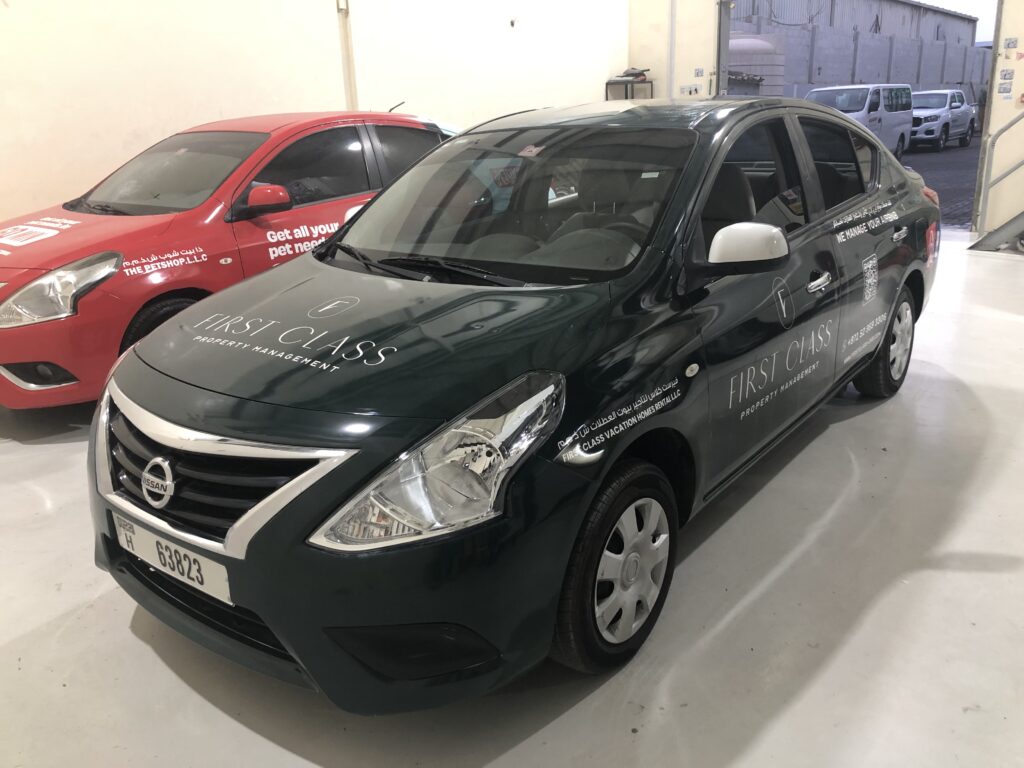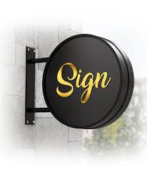
Definitely, the color and font of your signboard can literally decide whether your customers walk in or out. The signage board isn’t just an information board; it’s a psychological trigger. Different colors and fonts have different meanings, expressions, and impacts on the human brain. Your brain processes visual signals 60,000 times faster than text. So, a signboard is judged psychologically and emotionally way before it is understood logically. In fact, people don’t really read signboards; they feel them and connect to them.
How colours affect customer behaviour
Colours have a very big role in designing a sign board for a company. Color works on the limbic model in which the reaction comes through the emotional brain, not the rational one. It simply means that people don’t think about colors; they react to them subconsciously. This is why two identical signage boards with different color palettes have completely different viewpoints. Different tones of colors have different impacts on the human brain, and the customer behavioral result comes out to be according to the signboard’s color. But overuse of colors can also lead to a sense of aggressiveness or cheapness.
1. Warm tones (attract attention)
Warm-tone colors such as red, yellow, and orange depict a sense for high-energy or impulsive-driven businesses. These colors increase heartbeat and attention. It creates a psychological effect of an emergency situation, which activates the brain’s fight-or-flight system, making a person more alert and reactive.
A company signboard should be made carefully and consciously, keeping the color impact in mind.
| Colour | Expression | Best for |
| Red | Urgent, hunger, excitement, danger | Restaurants, sales and marketing |
| Yellow | Optimism, friendliness | Cafes, kinds-friendly stores |
| Orange | Energy, affordability | Gyms, fast services |
2. Cool tones (builds trust)
Cool tones such as blue, green, purple are preferred for long-term services. Green is the easiest color for the human eye to process, and it doesn’t stress out the brain. While blue lowers heart beat but it reduces appetite so it shouldn’t be used in food brands.
| Colour | Expression | Best for |
| Blue | Trust, calmness | Banks, clinics |
| Green | Health, growth, environment friendly | Pharmacies, eco brands |
| Purple | Luxury, royalty, creativity | Salons, boutiques, jewellery |
3. Neutral tones (premium feel)
Neutral tones such as black, white, and grey give a sense of premium and top-quality products and services provided. A black background with gold or white text feels expensive instantly.
| Colour | Expression |
| Black | Luxury,authority, power |
| White | Clean, peace, modern, technical |
| Grey | Corporate, serious |
Font psychology
Font is your brand’s voice. The type of font you insert in your company signboard not only tells about the service, but it also connects to the heart of a person emotionally. Fonts are not just letters they are perceived as personalities by the human mind. The font you use in your signboard answers the customer’s question, like whether the business is modern or outdated or if it is cheap or premium or if it is serious or playful.
1. Serif fonts
Serif fonts like Times New Roman feel traditional, stable, or authorized, which works best if they are used on a signboard for law firms, universities, and government offices, but they fail for young brands, startups, or trendy stores.
2. Sans-serif fonts
Sans serif fonts such as Arial and Helvetica are best used in a company signboard to depict modernity, professionality, honesty, safety, and effectiveness.
3. Handwritten fonts
Handwritten fonts work best for signboards of cafes, salons, or bakeries, as they look creative, artistic, and childish.
5 deadly signboard mistakes
These are the most common and deadly mistakes companies make while designing their signage board.
1. Decorative fonts
If the text looks too artistic, it becomes a hindrance in readability. As quick as the customer can read those texts, it’s better for the company.
2. Too many colors
A company signboard looking like a rainbow creates chaos and gives a sense of a childish approach towards the service. The color palette should be limited and precise.
3. Low contrast
If the contrast is low in a signboard, then the text disappears into the background and reduces the readability.
4. All capital letters
Use of all capital letters in your signboard makes it harder to read than the mixed case.
5. Shiny materials
Use of shiny material in company signboards reflects sunlight and becomes unreadable.

Conclusion
A harsh truth is people judge the price, quality, service and trustworthiness of your brand before meeting you actually, only on the basis of your signage board. What looks good is perceived to be good. That’s why the same business, same location, and different signboard for the company can turn the whole table. Your company sign board is your first impression which works as a silent salesperson. The sign board produces a brand reputation in physical form. A good signboard for a company is free marketing and works 24/7 to attract potential customers.
FAQs
1. Which font is best for a signboard?
Sans-serif fonts like Arial or Helvetica are best for clarity and visibility if you are designing a signage board.
2. How many colors should be used in a signboard for a company?
Ideally no more than 3 colours should be used as it looks messy and unprofessional.
3. What is the safest design formula?
Dark background + light text + simple bold font is the safest formula for your signboard.
4. Why do simple signs work better?
A simple signboard works better, as it builds trust by increasing readability and making it understood easily.
5. What colours attract most customers?
Warm color tones such as red and yellow and cool color tones such as blue and green work the best for your signboard for the company.


