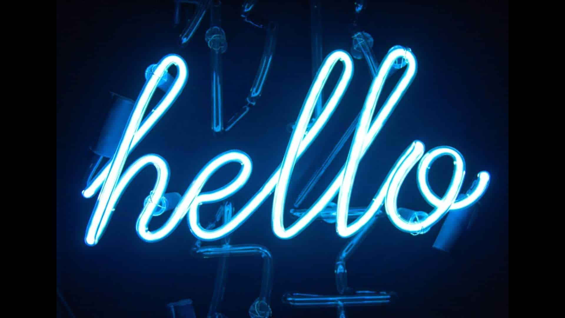
Neon light signage is a popular choice for businesses and individuals looking to make a bold and vibrant statement. The glowing appeal of neon signs can attract attention and create a unique ambiance. However, one crucial element that can make or break the effectiveness of Neon Light Signage is the font choice. This guide will walk you through the key considerations for selecting the perfect fonts for your custom neon light signage.
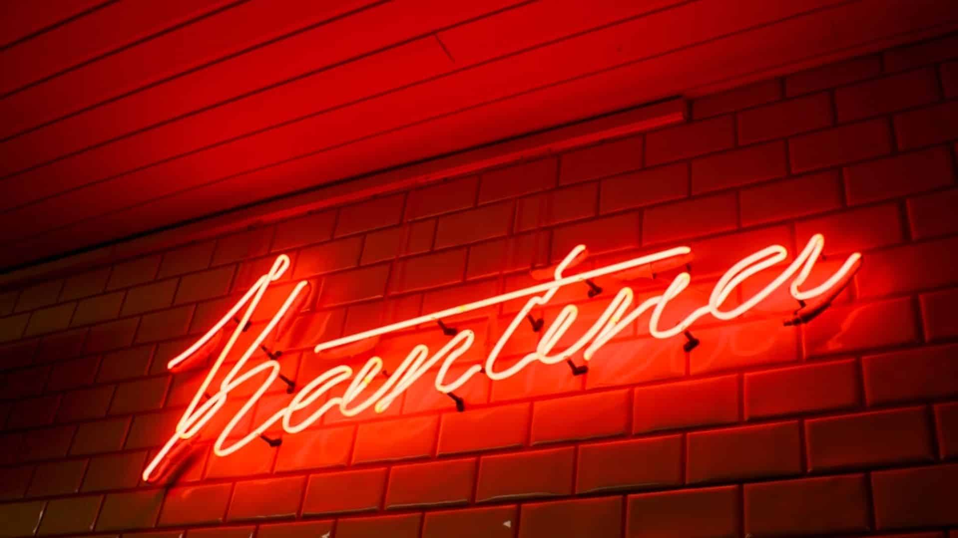
Understand Your Brand and Message
The first step in choosing the right font for your neon light signage is to understand your brand and the message you want to convey. Your font choice should reflect the personality and values of your brand. For instance, a playful, casual font may be appropriate for a trendy café or a children’s store, while a sleek, professional font might be better suited for a corporate office or an upscale boutique.
Nova Sign specializes in helping clients align their signage with their brand identity. Our experienced designers can guide you in selecting fonts that enhance your brand’s message and appeal to your target audience.
Consider Readability and Visibility
When it comes to neon light signage, readability and visibility are paramount. Your sign needs to be easily readable from a distance and in various lighting conditions. Opt for fonts that are clear and legible, avoiding overly intricate or thin typefaces that might become difficult to read when illuminated.
Sans-serif fonts are often a good choice for neon signs due to their clean lines and simplicity. Fonts like Helvetica, Arial, and Futura are popular for their readability. At Nova Sign, we ensure that the fonts we recommend and use for neon signage are both aesthetically pleasing and highly readable.
Match the Font to the Sign’s Purpose
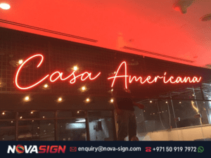
Different types of neon signs serve different purposes, and your font choice should match the intended use of the sign. For example, if your neon sign is for a storefront, you might want a bold, eye-catching font that can draw in passersby. On the other hand, if the sign is for an interior space, such as a restaurant or bar, you might choose a font that complements the interior design and creates the desired atmosphere.
Nova Sign provides customized solutions to meet the specific needs of each client. Whether you need a neon sign for outdoor advertising or interior decoration, we help you choose the perfect font to achieve your goals.

Conclusion
Choosing the right font for your custom neon light signage is a critical step in creating an effective and visually appealing sign. By understanding your brand, prioritizing readability, matching the font to the sign’s purpose, balancing aesthetics with practicality, and testing your font choice, you can create a neon sign that truly stands out.
Nova Sign Printing Advertising LLC has over 15 years of experience in the signage industry, offering expert guidance and high-quality neon light signage solutions. Contact us today to learn more about our services and how we can help you create the perfect neon sign for your business or personal needs.


No comment yet, add your voice below!